Custom Branding & Website Design Services for Bright Film: A Flash of 90s Romcom Style
Custom Branding & Website Design for Bright Film: A 90s Romcom Twist
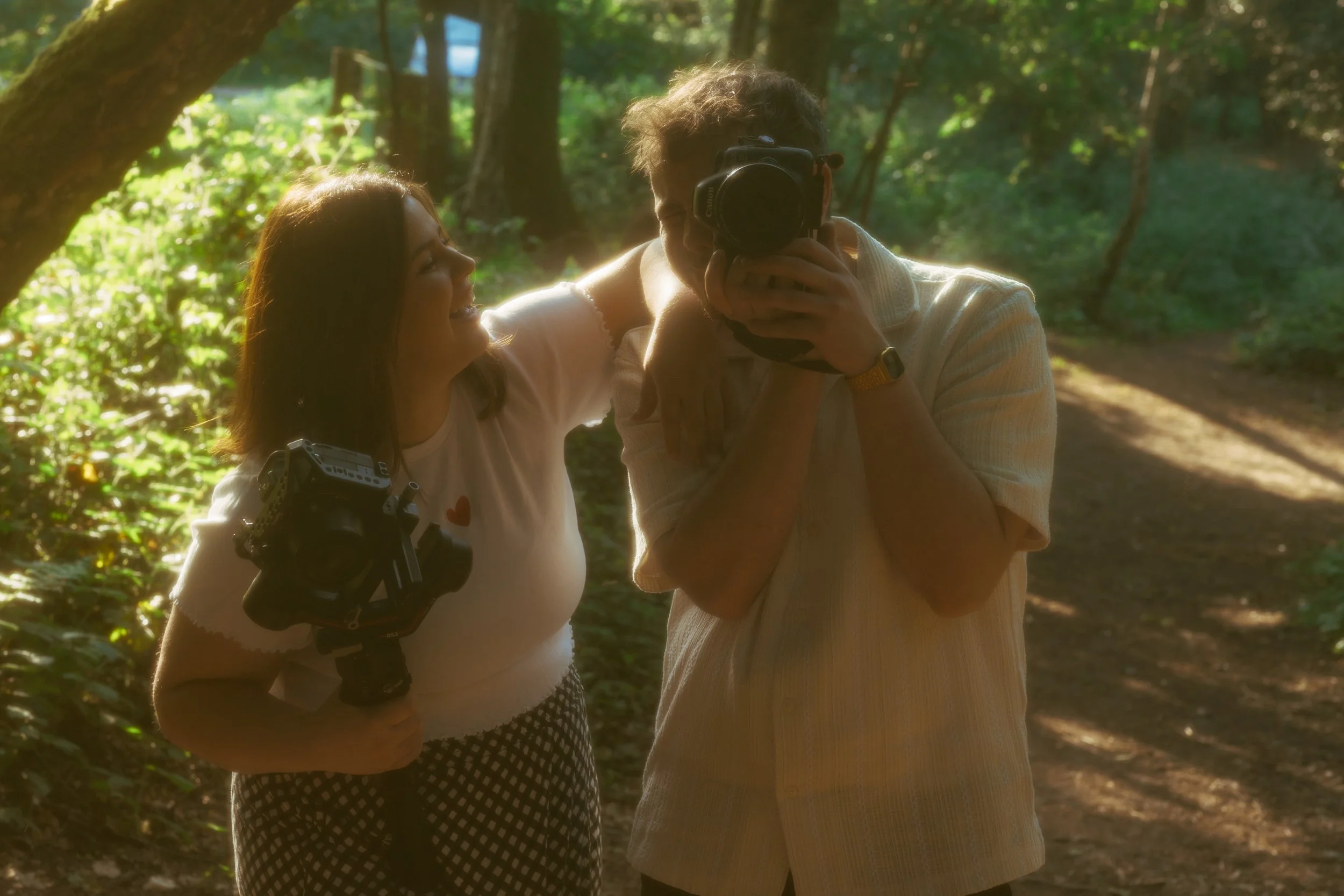
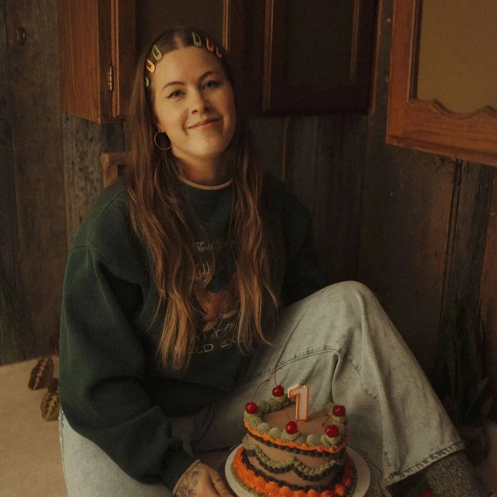
Bright Film is a UK-based photography and videography duo specializing in weddings – but they’ve got themselves quite a twist. Mat brings a passion for restoring vintage film cameras and Super 8s, while Penny channels her love of 90s romcoms into heartfelt storytelling.
Separate? They’re quirky and talented. Together? They bring the magic with their playful, nostalgic, and deeply personal approach to their clients’ wedding day albums and videos.
Their process and deliverables were both awesome, but here’s the problem: Their old branding and website didn’t reflect that special spark of theirs.
Instead of standing out in a relatively saturated market (the wedding photography world is steep competition!), their visuals felt generic and sort of run-of-the-mill. On top of that, their site design ended up confusing couples instead of immediately converting them. Their services weren’t clear, and – what felt worst of all – Mat and Penny didn’t feel particularly proud to show it off.
To them, every inquiry felt like reinventing the wheel. Talking someone into booking. Then doing it all over again.
The most important thing to say here is this: They weren’t lacking talent or expertise. They were lacking a brand and website that worked as hard – and as uniquely – as they do.
And that’s exactly where House on Fire came in.
From Bland to Bold: How We Transformed Bright Film’s Identity with Website Design & Branding
The Spark: Why Bright Film Came to House on Fire
Let’s be real: the wedding photography and videography space is…crowded. And that’s even sort of an understatement. Every scroll on Instagram reveals another pretty feed and Pinterest-style wedding visual blog.
Without a strong brand identity, Bright Film was risking fading into the blur of “just another photography team” despite the fact that they’re truly anything but.
Mat and Penny knew they needed something more aligned with their special spark. They were fielding confusing questions about their packages. They weren’t standing out online. And honestly? All of that resulted in one thing: they were starting to lose steam.
What drew them to House on Fire was our promise of no cookie-cutter branding. They’d seen enough camera icon logos and generic script fonts to last a lifetime. (Frankly, we all have).
They wanted something bold, custom, and alive. Something that reflected their brand's unique romcom twist.
They were stuck, though. They didn’t have the perfect vision mapped out. I’ll tell you what I told them – that’s not required to rebrand with House on Fire.
They didn’t need to know what the finished project looked like to start working with me. (And you don’t either).
What they had was passion for their craft, and a clear sense of how they wanted to feel when they showed up online: confident, recognizable, and excited.
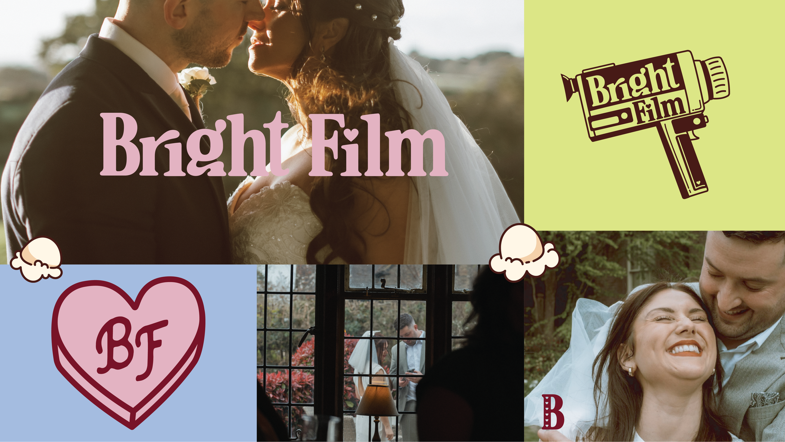
→ Want a peek at Bright Film’s custom brand identity? Take a look right here!
Fuel for the Flame: Strategy & Direction
Before we design anything, we dig. And Mat & Penny’s case was no different. Bright Film’s deep dive uncovered three very specific truths that became our north star for their brand identity and their website design.
Their secret differentiators were already in their story. Vintage film + romcom energy isn’t just cute – it’s niche-defining. While everyone else was chasing trendy aesthetics, Mat and Penny had an authentic lane waiting to be claimed. (So we claimed it).
Clarity beats out clutter every time. Couples shopping for wedding vendors don’t want to decode vague services or piece together confusing offers. They want clarity. Bright Film needed a streamlined way to communicate what they do – and why it matters.
Fun is a worthwhile strategy! Too often, creatives think professionalism means stripping away personality. But Bright Film’s dream clients aren’t stiff – they’re playful, nostalgic, and love a little camp. Leaning into that vibe for their branding identity and their website development and design service would attract exactly the couples they actually wanted.
At first, the concept skewed 80s. We were thinking a blend of neon nostalgia and Saved by the Bell sort of vibes.
But the more we refined and worked through their vision, the more the 90s romcom theme took center stage.
VHS tapes, candy hearts, and playful typography? That’s when their brand clicked into place.
Branding Creative Execution: Bringing Bright Film to Life
A Logo Suite with Personality
Remember when we said it was a big fat no to another stock camera icon logo? We ran with that the whole way. We created a versatile logo suite that could flex across Instagram, client guides, and their Squarespace site. A few of my favorite highlights include:
Hand-drawn illustrations of vintage cameras (because no stock icon could ever do them justice). This added camp, hand-drawn charm, and their spin on a classic logo.
BF in a heart as a wink to both Bright Film and “boyfriend/girlfriend” energy.
Wordmarks and submarks that kept things flexible while always on-brand.
Colors & Typography That Pop

Their palette balanced playful brights (Pretty in Pink, Sour Razzles, Faded Denim) with grounding neutrals (a creamy beige and a deep brown). This ensured the brand could feel romcom-fun and timelessly professional.
For their typography, we added a little chunky texture to bring in the fun and easy-to-read visibility:
A funky 80s-90s inspired display font for personality
A clean serif for clarity and readability
A playful script to add warmth without sacrificing legibility
Icons, Patterns, and Custom Illustrations
Custom illustrations are where the brand really came alive. We had a heck of a time putting these together and piecing out what should be animated and moving on their site. For their custom illustrations, we designed:

Candy hearts and popcorn kernels (romcom-meets-movie-night energy)
A VHS tape icon stamped with their logo
A cheeky illustration of their cat peeking from the site footer (for a personal touch)
Importantly, these illustrations weren’t afterthoughts. They were intentional storytelling devices that made the brand unmistakably theirs and easily recognizable among a sea of stock-photo cameras and flowy script fonts.
Custom Website Design Service: Making Their Wedding Photography Site More Than Just Pretty
A brand without a website is a half-built fire. As a business owner and website designer myself, do you know what I know to be true? You need both to spark connection and conversion.
Bright Film’s old site existed, but it wasn’t doing them any favors. Like many sites, it was confusing, clunky, and easily blended with the hundreds of other wedding photographers and videographers out there. It felt a little forgettable – and Bright Films is anything but forgettable
That site needed to do the legwork for them, so we rebuilt it from the ground up on Squarespace. Here’s what their wedding photography website design service included:

Five custom-designed pages with clear navigation
Responsive and mobile-optimized (because your dream client is scrolling from their phone in bed at midnight)
Embedded video galleries so couples could watch their work without leaving the site
Romcom-inspired Easter eggs like hidden quotes and playful cursor animations to delight and excite their website visitors
Service packages renamed after romcom moments, making the offers feel fun and unforgettable
All of these design and development choices weren’t about cramming in bells and whistles. It was about weaving in clarity so their people knew what steps to take to convert with creativity that made them an unforgettable brand.
Every design choice has a job: to communicate who they are, showcase their work, and guide couples to book.
Connecting the Dots for Your People: Why Branding + Web Design Matter
Here’s the bigger picture – because Bright Film’s story isn’t just about them. It’s also about how it changed the way their people saw them, connected with them, and chose to invest in them.
And I’ve got a feeling that’s something you’re looking for, too.
Your branding and website design aren’t just “the pretty stuff” that people see and either like or don’t on the first glance. They are:
Your first impression. Before a single consultation call, clients are judging whether you’re legit, trustworthy, and a fit for them.
Your silent salesperson. A clear, strategic site explains your services 24/7, saving you from endless clarifying emails.
Your filter. Strong branding attracts the right people and repels the wrong ones. Bright Film’s romcom-meets-film vibe isn’t for everyone—and that’s the point.
Your energy saver. With clear guidelines and templates, creating content becomes easier and faster. No more Canva chaos at midnight.
Bright Film is proof of all of that: when your visuals finally match your vision, everything else in business feels lighter, more memorable, and helps you stick better with the people you want to stick with.
The Aha Moments: The Brightest Spots of the Bright Film Design Service Project
Every project has fun little divots and pivots in the plan. For Bright Film, the biggest ones were shifting from an 80s vibe to a more authentic 90s romcom aesthetic, ditching darker tones in favor of bright, poppy colors that actually felt like them, and elevating their film equipment add-ons from “optional extras” to a core differentiator.
The realest AHA of all, though? Mat and Penny realized that the quirks they thought made them “too different” were the exact things that made them irresistible to their dream clients.
And they also realized those were the visual elements their brand was missing in the first place.
Branding & Website Design Impact: Bright Film Finds Confidence & Clarity
Once their new brand and site launched, their transformation was pretty immediate. Here’s what they noticed right away:
They’re excited to share their website instead of being embarrassed by it. (A huge transformation and a huge step for business confidence)
Client inquiries feel smoother – couples understand their packages and book with clarity.
Penny can focus on her storytelling and video editing without draining time on graphics.
They’re attracting couples who get the vibe and love the nostalgic-romcom energy – so they’re getting more inquiries from their people.
As they like to put it:
“It was so much better than what I expected!!! our original website was bland and lacked any personality. What Robyn made for us combined both of our professions, our likes, and quirky elements of our lives."
To me, that’s the power of branding and website design done right.

From Match to Inferno: Why Custom Matters
Like I said, this isn’t just about seeing the case study for Bright Film and thinking, “wow! What a neat brand!”
It’s about you, too.
If you’ve ever felt drained by Canva chaos branding, confused by your own website, or worried that your business looks like everyone else’s, then you already know the problem. Custom branding and website design services aren’t luxuries. They’re the difference between:
Getting ghosted by inquiries… and booking dream clients.
Feeling embarrassed to send your link… and proudly hitting “share.”
Wasting hours second-guessing colors and fonts… and focusing on the work you actually love.
Feeling cohesive, consistent, and aligned with the visuals and vibes of your brand
Knowing that when potential clients see your site they’re already on the right path toward booking
That’s why we do what we do at House on Fire. Because when your branding and site work, it doesn’t just look good – it changes everything.
Ready for Your Custom Branding Service or Website Design Service?
Bright Film’s story proves that your quirks, passions, and personality aren’t obstacles. They’re your superpowers. With the right branding and website design, those quirks become magnets for the right clients.
If you’re ready to feel what they felt – clear, confident, and lit up about your business – it’s time to stock your own fire.