Custom Branding, Website Design & Merch for Checkmate USA vs India: Turning Chess Into a Full Design Moment
When most people picture a chess match, they imagine a quiet room, polite clapping, and absolute silence while players stare at a board for long, drawn-out moments – sometimes even hours.
That wasn’t the vision for Checkmate USA vs India.
Founder Salim dreamed up something new for chess – an event that looked and felt more like a UFC showdown or sports arena spectacle than a traditional tournament.
It was a first-of-its-kind match in Arlington, Texas, pitting five of the top U.S. and Indian players (and streamers) against each other in a 5v5 format, complete with live commentators, roaring crowds, merch booths, and cameras rolling.
When the Checkmate team came to House on Fire, they had the concept. They had the players. They had the venue. They had the idea of what they wanted this event to be.
What they didn’t have?
Anything else.
No brand. No website. No merch.
No visual direction for an event set to launch in just a few weeks.
They needed brand identity and website design, like, yesterday – and a creative partner who could bring it all together fast.
That’s where House on Fire stepped in.
The Spark: Why Checkmate USA vs India Came to House on Fire
When Project Manager Marc first reached out, the team behind Checkmate was scrambling. (And to be fair, that’s kind of an understatement).
The event date was locked, sponsors were waiting, and they were missing everything visual – from their logo to their social content to a website.
Their goal was massive: to make chess fun and to give fans something that felt exciting and electric.
They wanted a design partner who could design fast (sure), but also think deeply – someone who could turn a raw, jumbled-up idea into a cohesive identity that felt thrilling, competitive, and new to the chess world.
We got there together.
We helped Checkmate go from “nothing yet” to a fully branded, ticket-selling, merch-stocked, camera-ready event – on a timeline that would’ve made most designers sweat. Wanna know how? Keep reading.
“The results were outstanding, praised by investors, sponsors, players, and the public. Her visual identity became a defining part of the event, with highlights viewed by tens of millions of chess fans around the world.”
– Salim | Checkmate SV Founder
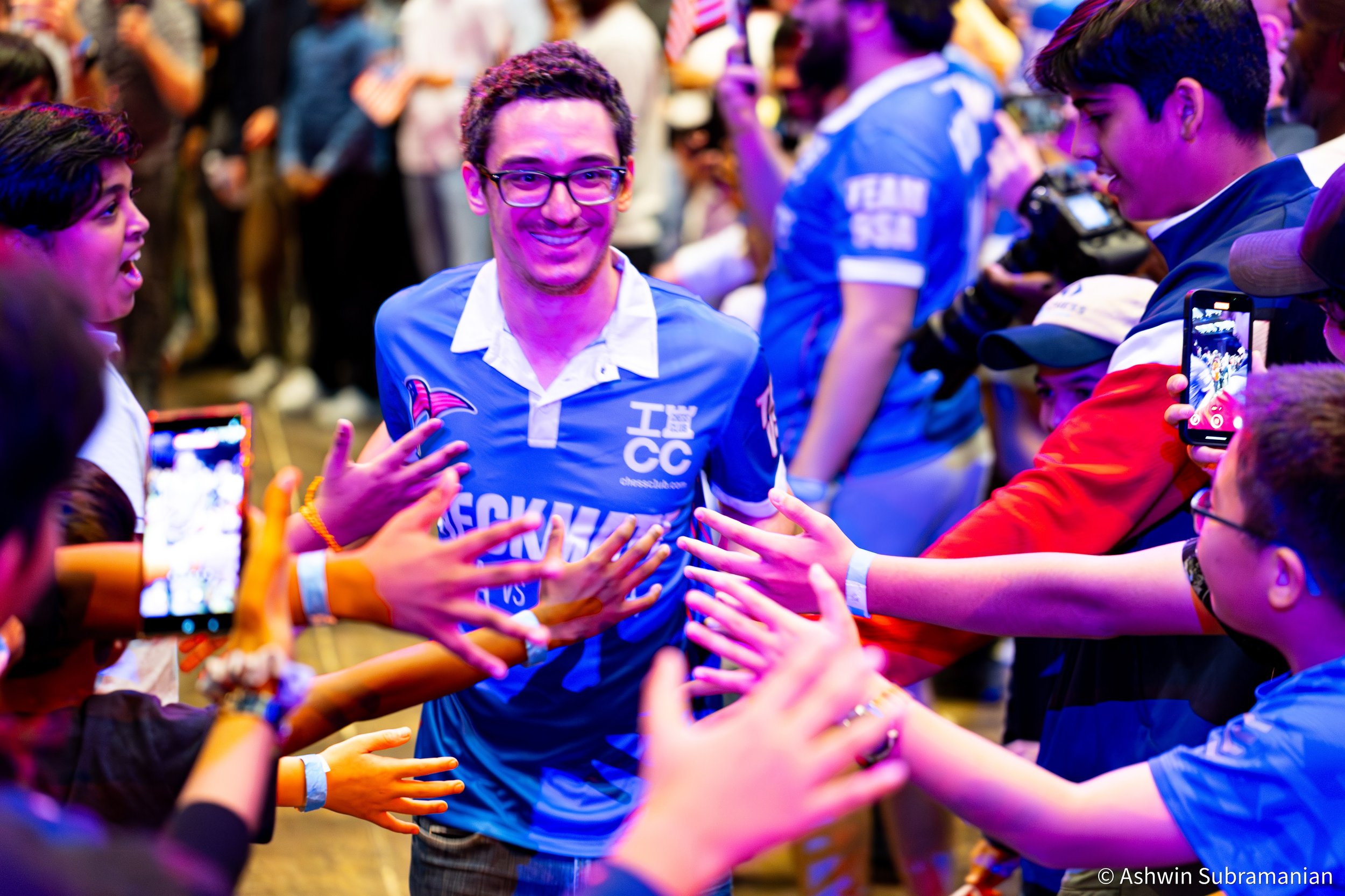
photo credit Ashwin Subramanian
Fuel for the Flame: Strategy & Direction
Before jumping into design, we dug into what would make this event different.
The chess world is filled with quiet, tradition-heavy tournaments – but this one was meant to add a little zest to a somewhat zestless sporting world.
We studied the visual language of UFC, soccer, and esports, pulling in inspiration from their bold typography, arena lighting, and team jersey aesthetics.
The vibe needed to say this very clearly: this isn’t your library chess match.
Visually, we anchored the brand around the rook, a powerful, defensive symbol that represents strength, structure, and resilience. It felt fresh in a space full of overused knight-and-king motifs.
The colour palette was non-negotiable: red, blue, orange, white, and black, blending the U.S. and Indian flags into a cohesive, striking whole.
And through all of it, one goal drove every creative decision: Make chess feel truly epic.
Custom Branding: Building a Difference & Competitive Identity
When Checkmate came to us, they had nothing but an idea. We turned that idea into a complete brand identity system – designed for arena-scale impact and screen-level clarity.
The Rook Shield
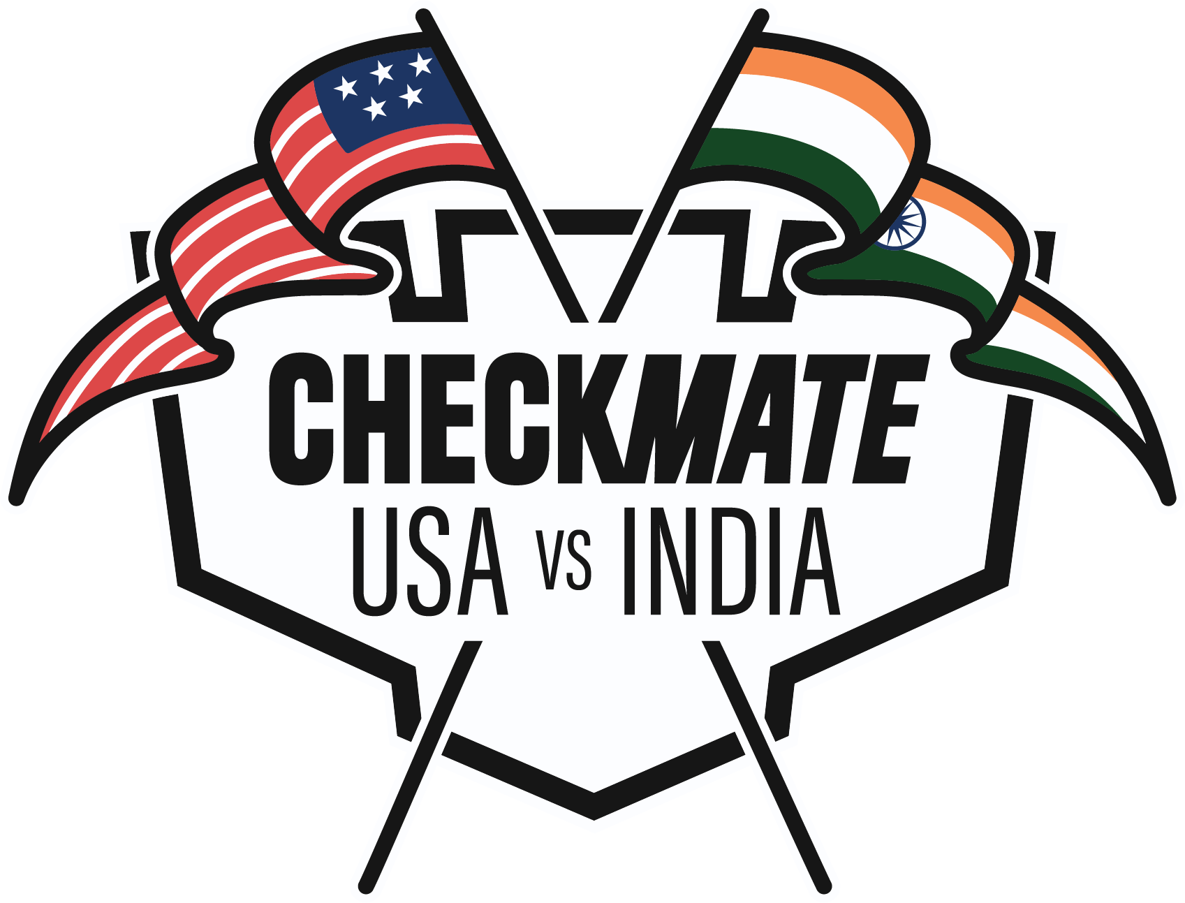
The hero of the brand was the primary logo – a dynamic emblem featuring a rook silhouette backed by a shield and interwoven U.S. and Indian flags. Of course, we created a full suite of logos to use across different platforms and use cases. But this one? It was the most recognizable and, in my opinion, the most iconic.
It was intricate, patriotic, and instantly recognizable (because nothing else like it existed).
The twist? It only worked perfectly in one version: black outlines, full colour, and a white border that made it pop on dark backdrops.
That one decision – creating just one perfect version instead of a dozen variations – proved to be a masterstroke (pun intended).
It read beautifully across banners, broadcast screens, jerseys, and digital layouts.
Icons & Patterns
We loved the logo, but we knew the identity needed more support than just one visual. We expanded the brand with a full icon suite and flexible patterns – everything from flag-based badges to sleek rook illustrations. These gave the design system depth but skipped the clutter of additional, powerful logos.
The lightning bolt – first introduced as a design accent – quickly became a signature symbol of the event, representing the clash of teams and the intensity of gameplay.
Color & Typography
We built a six-colour palette blending the nations’ hues with black and white for balance and bold contrast.
The typography combo was chosen for maximum readability on merch, LED screens, and signage:
A chunky display font for drama and athletic appeal
A clean serif for structure
A legible body font for versatility
The brand was both patriotic and professional – loud enough to get attention, but clear enough to look cohesive across every channel.
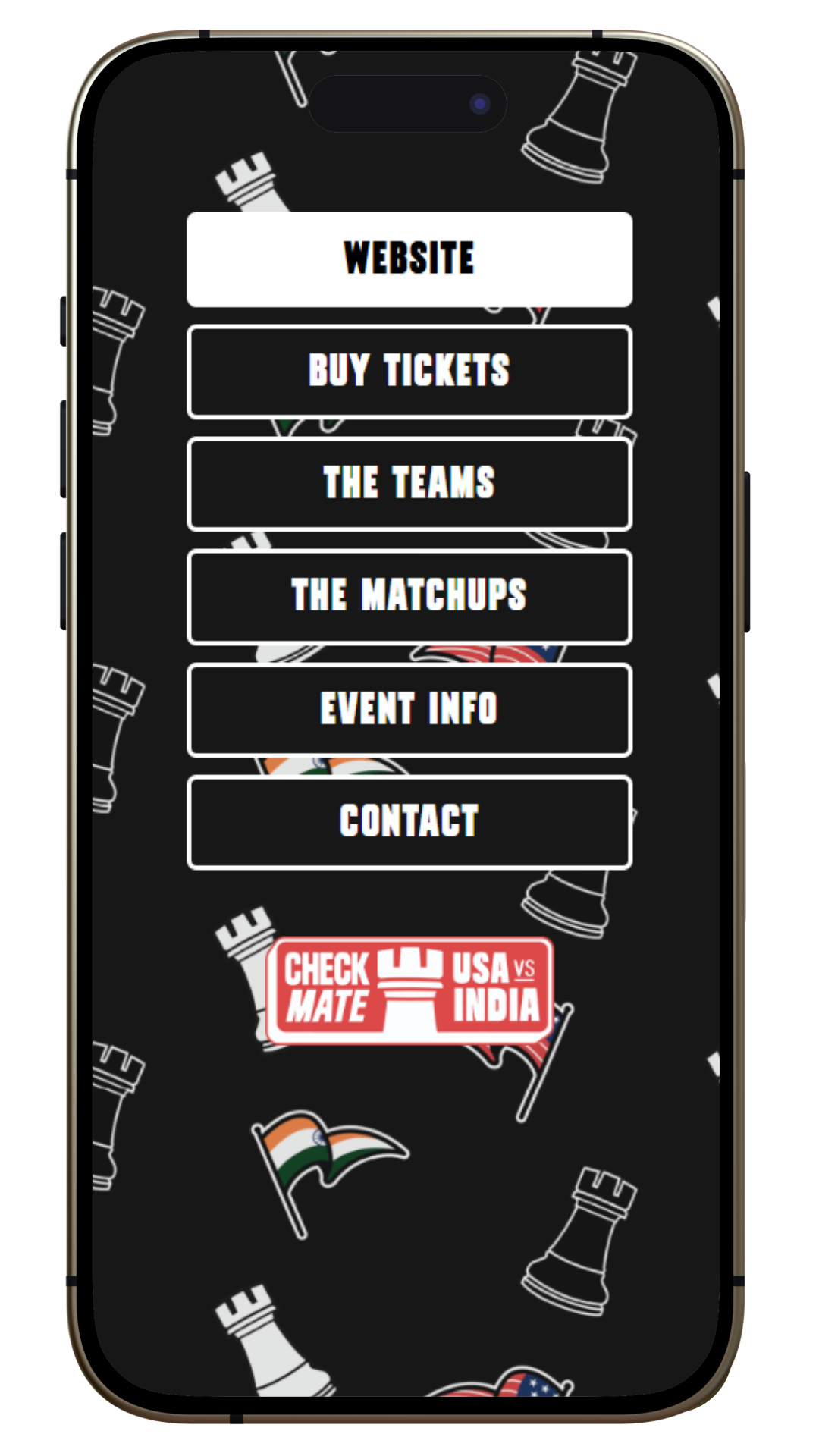
Website Design: Built to Hype, Sell Tickets, and Clarify
With branding locked in, it was time to bring it online and into the digital world. The event needed a website that could sell tickets, excite fans, and make information easy to find – all while matching the “this isn’t your normal chess match” vibes of the event itself.
We built a stunning five-page Squarespace site, including:
Homepage with the event trailer, countdown clock, and high-impact CTAs
About Page breaking down the event, teams, and matchups
Contact Page for media inquiries, volunteers, and fan questions
Ticketing Page (integrated via Tixr) styled to match the new brand
It was straightforward, provided the needed context, and gave the people exactly what they wanted – a chance to buy into this one-of-a-kind chess event.
Design & Copy Choices
This site wasn’t about quiet strategy; it was about a new kind of energy. Every headline leaned into the sports-entertainment tone:
“Witness Chess History Live.”
“This Isn’t Your Library Chess Match.”
“Full-Throttle Arena Spectacle.”
High-contrast black-and-white photography from Lennart Oates gave it the cinematic drama it needed.
We kept the navigation lean and intuitive, with a hover “About” dropdown that simplified access to key details like matchups, location, and team bios.
Functional Flair
The countdown clock on the homepage added a little touch of urgency and a nod to chess’s iconic timepiece. Sponsor placements, local chess club highlights, and fan zone updates kept the community engaged.
The result? A clear, high-energy site that sold out nearly a thousand tickets and helped sponsors say yes to funding the next big move.
Hand-Drawn Custom Merch Design: Wearable Excitement
Like with any merch project, it’s never about just stocking shelves with stuff. They wanted merchandise and extras that built team spirit!
Even though we hadn’t started out with this in mind, we ultimately created a complete merch drop that blended flair and fandom into each piece.
The whole point of the merch was to make sure attendees felt like part of this iconic, never-been-done-before event. They weren’t just spectators; they were part of chess history.
The Hand-Drawn Merchandise Collections
Patriotic Team Wear: Jerseys, hoodies, and tees for Team USA and Team India. Each player got a custom jersey design, and fans could pick their side with pride.
Chess Illustrated Collection: Playful, hand-drawn designs featuring rooks, flags, and House on Fire’s signature illustrative flair.
Join Your Local Chess Club Campaign: A creative tie-in that celebrated the local chess communities supporting the event, complete with poster-style graphics and a tearaway “flyer” aesthetic.
The Custom Merchandise Products That Sold Out
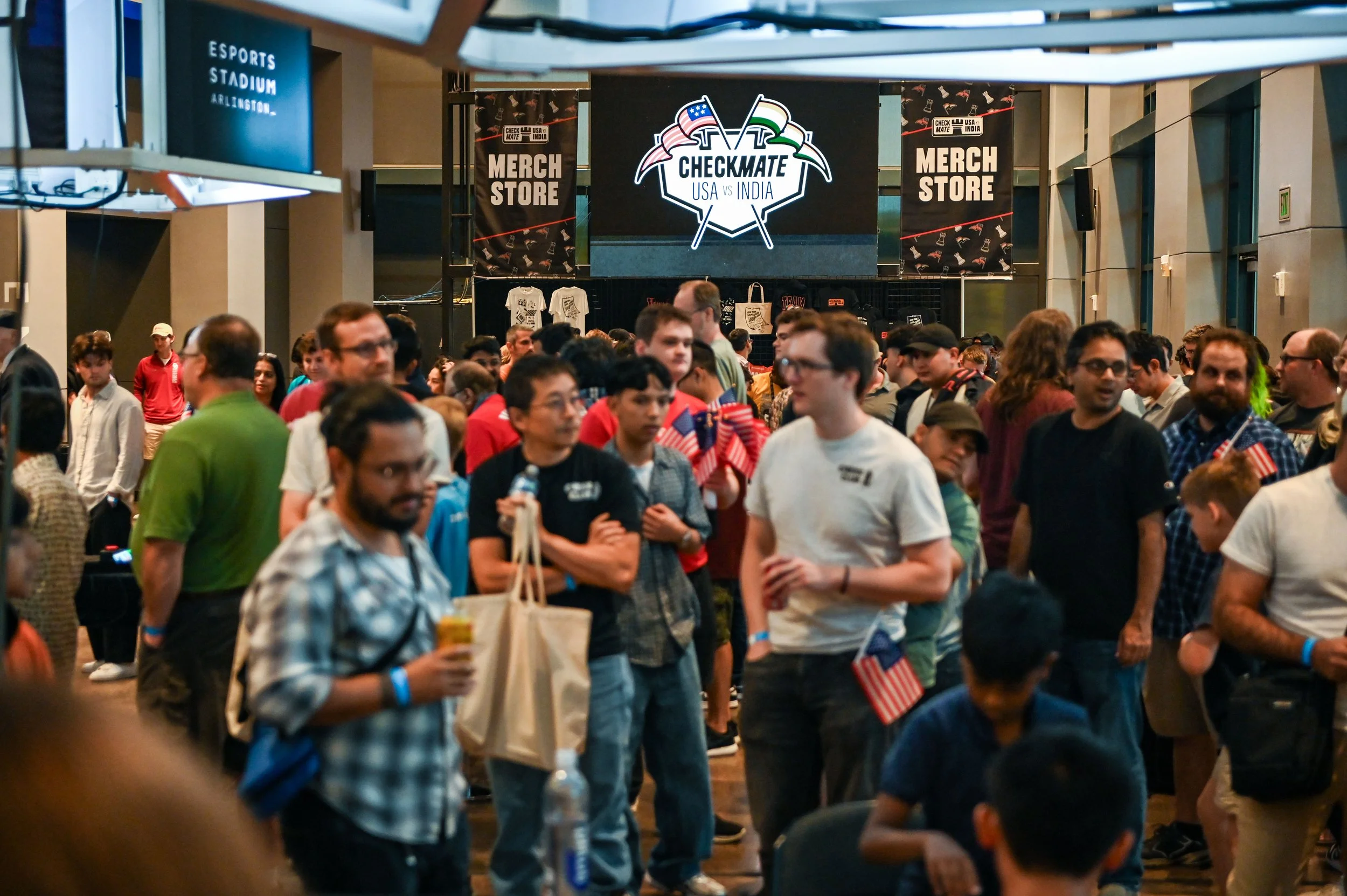
photo credit John Brezina
We designed all the hand-drawn illustrations for the event’s hoodies, tees, hats, totes, lanyards, volunteer shirts, and badges. How did the crowd react? The merch booth sold out of most items – especially Team USA apparel and popular player jerseys.
But the best part? The players themselves became walking billboards.
They wore their favorite merch all weekend – on stage, in interviews, on streaming, on socials – and they shared it online.
Fans, families, and sponsors all joined in. The branding was everywhere – alive in motion. (Which is what the best merch does, by the way).
The Aha Moments: When Design Met Reality
Some of the biggest breakthroughs for this brand design, website design, and merchandise design project came as we were working through it. Some of the have-to-mention lightbulb moments included:
When our lightning bolt element went from background shape to branding icon.
The checkered gradient that subtly nodded to chess without going full NASCAR.
And the single primary logo decision proved to be one of the smartest calls of the project – saving time, simplifying printing, and creating instant brand recognition.
Seeing those details come to life across banners, broadcast overlays, and jerseys was a full-circle creative moment.
The Impact: From Arlington to the Internet
By the time the lights went down in Arlington, the results spoke for themselves. The final numbers still haven’t quite been tallied up from the event, but what we do know is this:
Nearly 1,000 seats sold
Merch booths had product sell out (especially Team USA apparel)
Socials grew from <100 to 4,000+ followers
Viral moment with 15M+ views (Hikaru’s dramatic “king toss”)
Widespread online buzz – half outrage, half applause, 100% awareness
The event’s sponsors were thrilled, the audience was on fire, and the viral moment confirmed the event’s success: “This is what we wanted people to feel.”
Even better? The branding performed flawlessly under every spotlight – from stadium jumbotrons to Twitch streams. Their branding was cohesive at every turn and had a true identity that’s now recognizable.
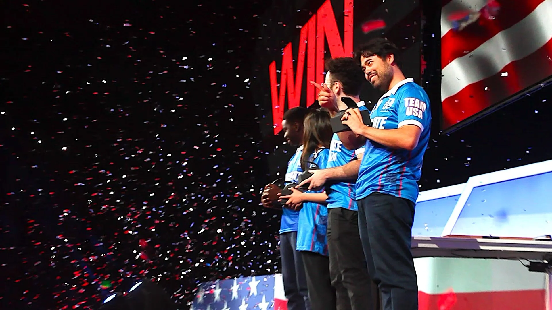
photo credit Connor Stewart
From Match to Inferno: Why It’s So House on Fire
This project was a creative full circle – a chance to build everything from scratch and watch it come alive in real time.
It was surreal to see the branding, merch, and web all working together – and to watch fans cheering in front of designs I made. It reminded me why I love this work.
Checkmate USA vs India proved that great design can ignite an event, turning a concept into a community and a game into a global moment.
And it’s a reminder that you don’t need a massive brand package to make a massive impact.
Sometimes, all it takes is one clear vision, one smart strategy, and a designer who cares as much as you do.
Ready to Spark Your Own Custom Brand Identity, Website Design, or Hand-Drawn Merch Service?
Whether you’re building a brand, launching a new event, or creating merch that people actually want to wear, House on Fire is here to help you turn ideas into identity.